Things Amazon Could Do Better
I’m a big fan of Amazon.com. It is far and away my online retailer of choice. I’ve been a Prime member since they launched the program in 2005. Books, computers, videogames, RAM, speakers, … you name it, I’ve probably bought it at Amazon.
But it’s time for some tough love. Amazon, your web site is in dire need of improvements. Here’s how you can make it better.
Don’t forget where I was when I turn on 1-click.
When I’m on an item page and want to make a quick purchase, the 1-click button only appears if I am signed in. Otherwise I am prompted to click “sign in to turn on 1-click.” When I click that link, I am brought to a separate page telling me that I have successfully signed in and enabled 1-click. But now I’m no longer looking at the item I want to buy. This redirection is unnecessary. Instead, send me back to the item page. The new big button that says “Buy with 1-click” is sufficient notice that I’ve turned it on.
Give me a real faceted search.
I want to drill down by several search criteria, and I want to do it quickly. Here’s a search I’d like to execute: show me all of your coffee makers made by Cuisinart or Mr. Coffee that are priced under $50 and available with Amazon Prime shipping. Right now this search takes four back and forths to execute, and I can only see one particular brand at a time.
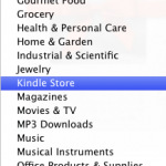
Eliminate two thirds of your “departments.”
Departments on Amazon are highly ambiguous and this makes things difficult to find. If I want a USB wall charger, where should I look? “Electronics” seems like an appropriate department. But what if it’s typically used with a cell phone? Better check “Cell Phones & Service,” too. And is that where I’d find a MicroSD memory card? Or would that be with “Camera & Photo?” Because there is no consistency over where a product type is placed, I better check that “Everything Else” department, too. Thank God you have a separate department for “VHS.” I’m sure that pleased both of the people who bought VHS tapes this year. Other examples of high-level categories that can be merged: “Toys and Games” and “Videogames”; “Grocery” and “Gourmet Food”; “Shoes” and “Clothing”.
Show me lists I care about.
If I search for the book Assassination Vacation, an appropriate list to show me might be “Historical Books.” Instead, you’re showing me “Books I read in 2007” by Lindsay L. Miller. I don’t care what Lindsay read in 2007. Sorry Lindsay, it’s nothing personal.
Stop shoving the Kindle down my throat.
I get it. You really want me to buy a Kindle. I know this because every time I look at a book, you put this at the top of the page:
Assassination Vacation and over 360,000 other books are available for **Amazon Kindle **– Amazon’s new wireless reading device. Learn more
and this thing on the side:

This is particularly frustrating because I already own a Kindle! And I know you know that, because you sold it to me!
Kill the “Robby’s Amazon.com” link.
My Amazon.com should be at http://www.amazon.com. You’ve already portalized this page to show me the things I’ve looked at recently and the things you think I might like. Creating a second portal-like page just confuses me. Which one am I supposed to shop from?
Ask me if I have a Blu Ray player.
And when I tell you that I do, remember it. Then when I search for movies, show me the Blu Ray editions before the DVD editions.
When I look at a product, tell me everything you know about the product…
…instead of making me click to get the information I need. For example, here is a Nikon lens I’m interested in. But if I want the “technical details”, I have to click and go to a separate page. You are wasting a lot of space showing me related items, sponsored links, user-made lists and user-made guides, instead of showing me information about the item I’m looking at.
Do not default my search to be within a particular department.
I often have a list of unrelated things to buy. For instance, after I’m done looking at the camera lens, I may want to search for a book. What do you think is going to happen when I click “Go” here?

It turns out your search is pretty good. When it doesn’t find any “War and Peace” items in “Electronics,” it will give me the top 3 results from other departments. So you’re almost off the hook. But you get the idea. This is not ideal. I will not get the full search results that I expect. It doesn’t make sense for you to coerce me into searching within one particular department, especially in light of complaint #3.
Simplify your navigation.
These things all go to the same place. Why are there three routes to get there from the home page? It’s cluttering and overwhelming. Pick one.